The Looney Lodge has been a fun project at the Cottage in Maine. When we purchased the house back in November of 2021, the apartment over the garage was considered a bonus. It was in disrepair and was, in our opinion, inhabitable. We didn't need the space right away but knew it would be an exciting way to expand the capacity and equity in the property.
When I began the design process, my goal was to make design choices that were aligned with the main house but also something that I might not usually make.
Design Inspiration
I was immediately drawn to blue kitchen cabinets. This seemed like a design choice that was perfect for a small space and something unexpected (normally I choose white). I also liked the idea of complimenting the blue with oak. Then I started to see copper and antique gold hardware and faucets and I knew that I had to go for it. I loved the way the blue looked with these accents.
The blue cabinets were a must! We went with Medallion Cabinetry in Potters Mill Flat Panel door style and the color Lakeshore (which just felt right). We made some slight layout changes within the kitchen design. The layout before had a peninsula which made the kitchen feel closed off, small and restricted the walk paths through the space as a whole. We changed out the peninsula for an island and made the most of the cabinet space.
Some must haves for a small kitchen:
- Dedicated trash / recycling cabinet
- Bank of drawers next to the sink
- Built in Microwave
- Smart use of corners (in our case, this meant a lazy susan)
- Extra seating at the island
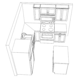
Here's the finalized layout:
What isn't shown in this drawing is the slope of the ceiling on the left side over the sink. This prevented us from having any additional uppers and instead leave that space open. The previous design included modified upper cabinets that couldn't actually hold regular items and that made the space feel smaller and darker. I decided that I wanted the sink to be a focal point and make the kitchen feel bigger.
Here's a fun before and (mostly) after:
The Details
I loved choosing the details. After picking out the cabinets (and knowing that we were going with oak hardwood floors) I started to explore hardware options. I loved the warmth of the antique copper. It accompanied the blue and made the space seem lived in and cozy. This started a search for the perfect color pulls, sink faucet and sconces (that all matched). This ended up being the hardest part of the design. I wanted something that wasn't too gold but also wasn't too orange or shiny. I found the pulls on Etsy and that started the search for the faucet.
I love the end result but I had some nervous moments. In the age of online shopping, it's difficult to truly know how the finish and color will look in real life. I did a lot of mock ups and mood boards on the computer with different products to reduce the risk of ordering something that didn't work. Ideally I would have found an antique looking faucet that has two knobs and a more traditional look, but I was focused on getting the right color and finish. I think that the modern vibe actually elevates the space and it's a good contrast.
The countertops were another big design decision. I didn't want to compete with the blue cabinets and the hardware. I wanted the countertops to fade into the background. I love the Carrara marble look but it's not practical for a kitchen in an apartment. We went with a quartz that has some subtle veining in it. We sourced it from Home Depot and it's called Empira White from Caesarstone.

We sourced the appliances from GE and got a great deal. We didn't get anything fancy but I was pleasantly surprised with the quality of even the lower end models.
That's it for now on the design of the kitchen. There will be future posts on the final product with the finishing touches, furniture and accessories.


Comments
Post a Comment